skip to main |
skip to sidebar
 I realize my posts havn't been all that interesting lately, but I really haven't been drawing as much as I usually do! I guess I'm still not really out of my rut. Anyhow, I was looking through a bunch of drawings from the past couple of months and pulled out the more realistic ones to post here.I suppose a lot of people would say that these are hardly "realistic," but compared to the kinds of cartoon drawings I like, these look pretty boring and uncartoony to me.
 It's sort of funny, because when I was 14 or so I LOVED drawing realistic portraits of people. I'd spend hours getting every detail right and shading the whole thing. When I try to do it now though, I find I'm worse at it. My attention span has wizened and the urge to exaggerate things always takes over, even without my meaning it to. Maybe I'll dig some of them out of the closet and post them, if anyone would care to see them. Here are some un-inspired phone doodle heads:
 I actually really like how the colors turned out on the girl on the right side here...my scanner wouldn't pick up the colors, so I had to take a photo of it.
  A lot of people have been demanding coloring lessons, but I probably won't do one. To be honest, I don't really have any coloring theories that I think that hard about. There's one tip I could give for coloring with markers: mix your colors and layer them, instead of just using "grass green" or "sky blue" or whatever.Sorry for the lack of enthusiasm- I'm going to try hard to get some good mouth drawings done so I can post them!
Wow, this past week has been lousy! I haven't been drawing as much lately, but here are some doodles so I don't look lazy. Here's a horse for all of you who want something other than girls...
 Some pretty girls who don't approve of any of us. I like the tall-hair girl, but I don't know about Ms. Broken-Arm.
 Oh, I don't know...Hey, I'm going to start answering questions when I post so that you don't have to go searching for them through the comments.Josh-"Also, do you have an outie belly button, because it looks like it in that picture."No, I it's just fun to draw them that way. :)Gigi-" do a mouth post!"I want to, but I'm really having a hard time figuring out just what to talk about and how to articulate it! I will think about how to do it, but in the meantime, if you have a specific question about it, I'll try to be helpful!Well, that's all for now...
Lots of people have been asking me about inking lately, so I'll try to remember what I learned about it a long time ago and post it here. My first job ever in animation was inking for Spumco's "Weekend Pussy Hunt," and there were so many rules that they were all written down on a 2 page memo for all the inkers to post up in front of them. I wish I had those now, cause I'd just post them! Fred Osmond was one of the guys who taught me how to do it, so maybe he'll talk about inking some and fill in the blanks where I forgot stuff...he has some inked pictures on his blog, and they're really good examples of excellent inks.
http://cartoonsandcaricatures.blogspot.com/
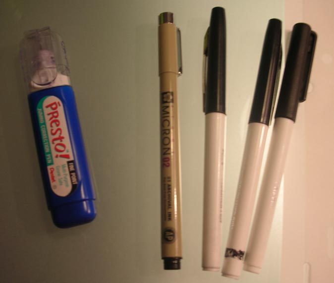
So anyhow, here's a picture of the pens I like to ink with best:
 Those black and white pens on the right are "boldliners' made by Eberhard Faber (that's what they're called, right?). I'm pretty sure they don't make them anymore, which is awful because they're the easiest inking pens I've ever used. They're cheap marker pens with felt tips. They're good because when you start out using them, they have nice sharp points, but after a while begin to get mushy at the end, making it easier to put pressure on them to get thicks and thins. There are other felt tip markers you can get, and they work alright too. Then I use Microns for small and delicate lines, and for fixing up any wobbly lines that the boldliners made. The white out is my best friend when inking, because I tend to put my hand right into the wet ink and smear it all over the place.
I had to ink an older drawing a couple of days ago for a poster, so I took a few pictures to show the ink in progress. I don't know if it'll be helpful to the people who asked about inking...I hope so!
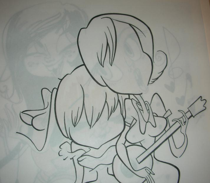
 I always start with the thickest lines first, and leave any details for last.
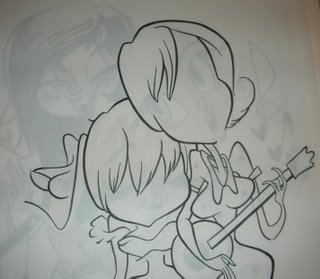 I think that the head on the right girl has nice thicks and thins, but the rest of her body and arms need to be made more consistent...right now all the lines are the same thickness and it's not as interesting looking.
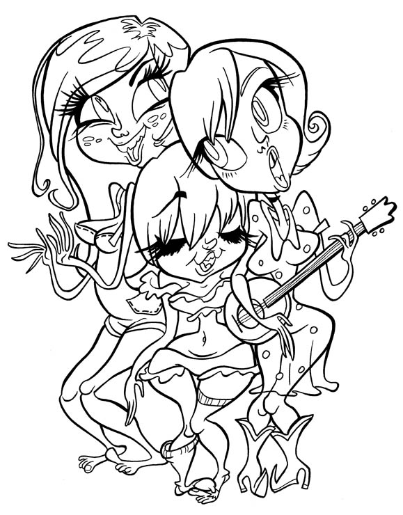
 Here's the finished ink, which turned out alright, even though there are some things that could be better...for instance, the place where the middle girl's hip comes too close to the right girl's dress. The lines get all mushy in there, so I'll probably have to fix it later. It's hard to avoid tangents when inking something crowded like this drawing, but I think I avoided some that were in the original drawing.
So here are the rules I remember from when I inked for money!
-Use nice thicks and thins.
-Thick lines are for larger shapes and shapes that are closer to you.
-Thin lines are for smaller shapes and details.
-Details within the drawing, like smile lines or clothes wrinkles, should help to describe the larger shapes that they are a part of.
-Try not to ink inside or outside of the lines, but stay on top of the original drawing.
-Make sure lines follow through. For instance- if I took away the instrument that the girl on the right is holding, the lines on her body and arms should look like they would connect.
-Floating lines, like smile or cheek lines, should go from thin to thick to thin, with the middle being thicker. It looks meatier that way!
-Lines that end should taper to a nice pretty point.
-Pay attention to subtleties in the drawing, and try not to dumb them down when inking over them. That brings me to another thing...
I scanned in some inking notes from John's Bjork Video, and they're better for understanding a bad ink from a good ink.
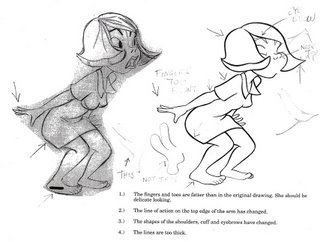 This is a really helpful piece of paper here! And besides the notes that are written here, there are some other things that are missing from the ink...Bjork's cute butt has some nice organic angles in the sketch, but turns into a boring curve in the ink. It may seem like nitpicking, but when enough lines get dumbed down it makes Bjork look like a balloon girl instead of a real flesh and blood girl, which is how she started out in the sketch.
 Here's a nicer ink...the lines are pretty and the thicks and thins are in the right places. For the most part I think it's a really nice copy of the original, although some subtle curves in her cheek look like they got lost. It's not easy to get perfect, but the result is a lot better if you don't think about it just as putting black lines on a piece of paper!
Now it's plug time! The ink I did is for a poster that will be sold as prints at an uncoming art show...it'll be fun! The show is May 27th through June 4th, and it'll be featuring John K's art (although some of my stuff and maybe some other spumco people's stuff will be there too). There's a big to-do on the 28th, with the gallery show at "Ever Picture Tells a Story" and cartoons at the Aero Theater across the street. John will be there and there will be lots of art for sale. John's got more details over at his blog, so check it out!
http://www.johnkstuff.blogspot.com/
Also, my pal Chad just put up his blog, and it's going to be great!! He's really really good, and here's proof:
 Say hi to him at his blog and tell him to post every day!!
http://cartooncrap.blogspot.com/
 I realize my posts havn't been all that interesting lately, but I really haven't been drawing as much as I usually do! I guess I'm still not really out of my rut. Anyhow, I was looking through a bunch of drawings from the past couple of months and pulled out the more realistic ones to post here.
 It's sort of funny, because when I was 14 or so I LOVED drawing realistic portraits of people. I'd spend hours getting every detail right and shading the whole thing. When I try to do it now though, I find I'm worse at it. My attention span has wizened and the urge to exaggerate things always takes over, even without my meaning it to. Maybe I'll dig some of them out of the closet and post them, if anyone would care to see them.